Hide Entity State Icons
By default, Home Assistant adds icons to nearly all user interface components. In many occasions, icons are not needed at all. Scenario:
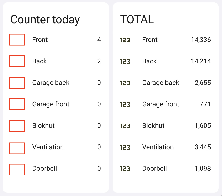
A card with 5 counters
Why would you need counter icons when the card title says “Counter” and you know what these numbers are? With Home Assistant cards you can hide icons so what’s my problem?
NOTE: at the end of this post you will see a full example.
NEXT: you hide icons by typing a space in the icon field (or add ” ” in the card YAML)
Result: a horizontal-stack card with 2 (‘sub’) entity cards.
red squares: where the icons used to be.

| LEFT: with hidden icons | RIGHT: with icons |
Problem: the ICON is hidden but it still uses the icon SPACE (see red squares) !
Solution
Apply a style using the card-mod plugin (community / Github). The easiest way to install? via HACS.
With this plugin you can apply CSS styles to nearly all HA UI components. Below is the previous example but now with the card-mod config that removes the icon.
(full code example: at the end of this post)
After installing, edit the card and switch to the code editor.
entities:
  - entity: counter.frontdoor_today
    name: Front
    card_mod:
      style:
        hui-generic-entity-row:
          $: |
            state-badge {
              display: none;
            }
Note that when you use this method (CSS) to hide the icon there’s no need for the “icon: hidden” command in the card YAML code anymore.
![]()
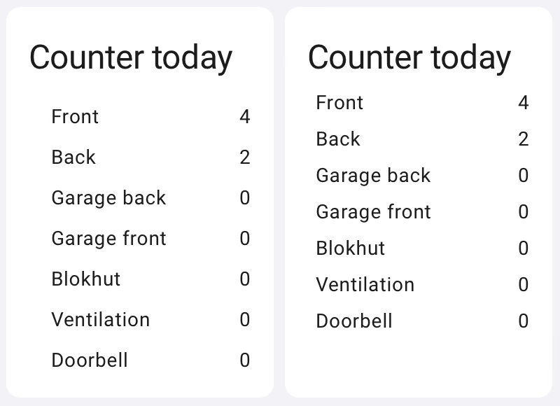
Result: the icons are hidden and the space between each item is smaller.
You can create an even better fit (less margin on the right, less space between rows) by applying additional changes. The result looks like this:

| LEFT: result of the first modification | RIGHT: additional CSS to reduce the space between lines. (see below) |
In many cases I find the space between objects too big, especially for FUNCTIONAL user interfaces. With these you want to see what you need to see without caring about the looks.
Example card-mod to reduce the space between entities and less left-margin:
card_mod:
style:
  .: |
    ha-card div#states div {
    margin-top: -10px !important;
    margin-bottom: 15px !important;
    margin-left: -10px !important;
    }
And here’s the card with everything combined – the icon-hiding and white-space-reducing changes:
type: horizontal-stack
cards:
  - type: entities
    title: Counter today
    entities:
      - entity: counter.frontdoor_today
        name: Front
        card_mod:
          style:
            hui-generic-entity-row:
              $: |
                state-badge {
                  display: none;
                }
      - entity: counter.backdoor_today
        name: Back
        card_mod:
          style:
            hui-generic-entity-row:
              $: |
                state-badge {
                  display: none;
                }
    card_mod:
      style:
        .: |
          ha-card div#states div {
          margin-top: -10px !important;
          margin-bottom: 15px !important;
          margin-left: -10px !important;
          }
  - type: entities
    title: Counter today
    entities:
      - entity: counter.frontdoor_today
        name: Front
        card_mod:
          style:
            hui-generic-entity-row:
              $: |
                state-badge {
                  display: none;
                }
      - entity: counter.backdoor_today
        name: Back
        card_mod:
          style:
            hui-generic-entity-row:
              $: |
                state-badge {
                  display: none;
                }
    card_mod:
      style:
        .: |
          ha-card div#states div {
          margin-top: -10px !important;
          margin-bottom: 15px !important;
          margin-left: -10px !important;
          }
NOTE:
- icon hiding: is applied as a style PER ENTITY.
- white-space reducing code: is applied PER CARD.
Hope this helps you a bit! :-)
DJ
